 |
 |
|
Brett holds a Bachelor of Science Degree in Information Technology with a concentration in Web Design and Development from Colorado Technical University. He was a member of the Dean’s List, as well as a member of Phi Theta Kappa. He has studied art and design, database management, project management, as well as mastering various programming languages. For thirty years, Brett worked in the music business as a recording engineer and producer. He has worked in many facets of audio production from multi-platinum selling records to jingles for advertising campaigns large and small. He has also worked from time to time as a session guitarist. In 2002, Brett and his family moved to Madrid, Spain to collaborate with Alejo Stievel in the creation and design of his new recording studio. Originally contracted for nine months, Brett ended up staying in Spain, recording and mixing live sound, for over eight years. He has worked with major artists from Spain, Ireland, South and Central America, Mexico, and Cuba, as well as North America and other countries in Europe. Today, Brett is concentrating on the development of Web Sites and the Internet, and is always looking to push the limits of what the Web can do. He is interested in the potential of the Web as a driving force in connecting people throughout the world. His clients range in size and their projects range in complexity from simple personal Web Sites to online stores. He has created Web Sites for Electronic Interface Associates (www.eiaonline.net), SATPrepCo (www.satprepco.com), Rabbit and Dragonfly (www.rabbitanddragonfly.com), and AllowanceTrack.com (www.allowancetrack.com). Of course, Brett can be found as well at www.brettrader.com. |
 |
  |
  |
  |
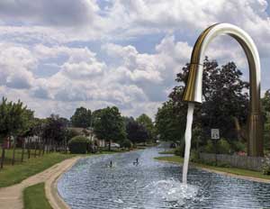
Created using Adobe Illustrator |
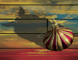
Created using Adobe Photoshop |
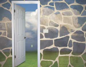
Created using Adobe Photoshop |
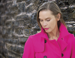
Created using Adobe Photoshop |
 | Advertising Banner Created using Adobe Photoshop |
 | Web Graphic Header Created using Adobe Illustrator |
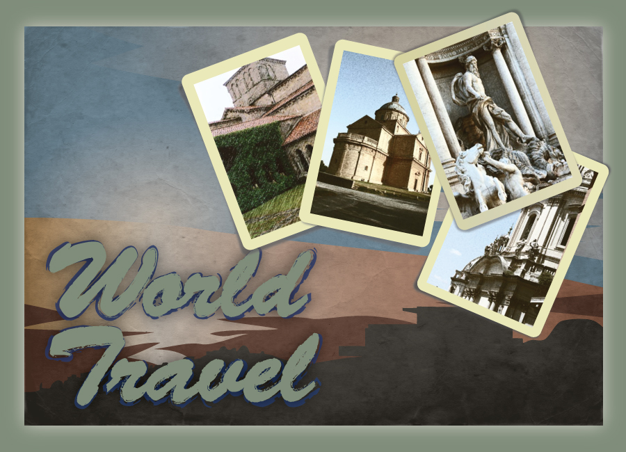 | Postcard Created using Adobe Illustrator |

The careful use of typography can help to make text more readable, interesting, and appealing. The concept of typography dates back hundreds of years and includes things like selecting a type face, size, color, leading (the vertical space between lines of text), kerning and tracking (the space applied around individual characters), scale, and weight. Just as a graphic or even a sound can be used to make an association with a specific brand, typography is often used in the same way. A specific typeface can be chosen to create a personality for the brand, whimsical or serious, it is yet another way to build a connection between the brand and the viewer. Type can also be formatted into the shape of an image. This communicates in two ways at once, and can be a creative way to capture attention. Advertisers assign a lot of importance to choosing a typeface for their brand in order to present the right message to their customers. | |
| BR WORDS & MUSIC Created using Adobe Illustrator | 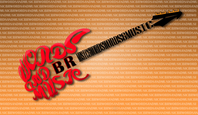 |
India Ink on Parchment |  |
Created using Adobe Illustrator |  |
Created using Adobe Illustrator |  |
Created using Adobe Illustrator |  |

With the advancement of Web 2.0, the internet has the fundamental capability to interact with users. This provides a platform that is more entertaining, and intuative for the user. Things like roll-over effects provide feedback to the user so that they know when they are hovering over something that can be clicked. Additionally, a box may appear near the cursor that contains a short description of what the user can expect to see when they click on the link. A website may request data from the user in order to present targeted information in response to a request. Weather data targeted to the users location, Stock market activity between specified dates, news updates linked to an email account; this is what Web 2.0 can provide. Interactivity makes the internet more useful and more fun! Here are some examples: | |
Product Showcase...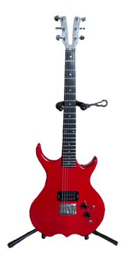 Use the slider 1 |
Fun & Games... |

|
||
|
||
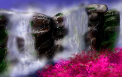
| For me, it's all about the details.  |
 |
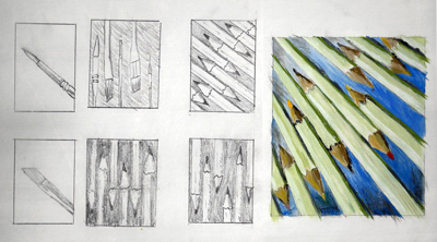 | This series of sketches were for a study in cool and warm dominance using "found" objects. The final triptic on the right is oil on canvas and 4'x 1.5'. | 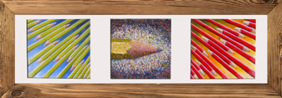 |
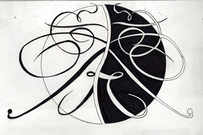 | I wanted to create an artwork using fonts, showing the art that can be derived from typography. The initial conceptual sketch on the left was done using markers on sketch paper. The finished product is India Ink on parchment. |  |